I remember when Xavier went away from the X and began showing more of D’Artagnan they moved to more of the cartoonist imagery like the new UVa ones with the hat etc.
It’s just not the same the simplicity of the V-Sabre is what made it so great
I remember when Xavier went away from the X and began showing more of D’Artagnan they moved to more of the cartoonist imagery like the new UVa ones with the hat etc.
It’s just not the same the simplicity of the V-Sabre is what made it so great
https://www.cavalierteamshop.com/dept/new-logos?cp=1225_107945 these kinda look smooth
agreed. the simplicity of UVA’s logo is what made it stand out
The blue with the orange trim is pretty slick same with the orange background and blue text. Reminds me of the older kit they used to wear
Maybe this is like a “New Coke” deal…
I don’t get why they did this. Bored in quarantine??? Unnecessary
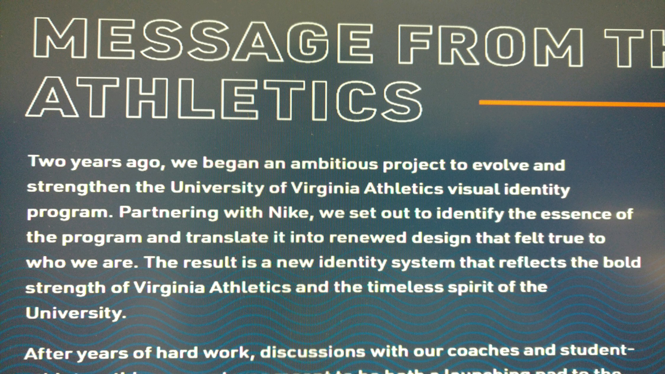
I was just texting with some friends, and being a branding person, I’d imagine this has been in the works for months maybe a year and it was always scheduled to launch around now. Plus with the money already sunk into it, and the lost revenue from losing spring and summer attendance, they just had to push forward with it to avoid a total loss.
Yeah but I still don’t understand why this was necessary. Even if it’s been in the works for over a year, still unnecessary.
Now that I totally agree with. I don’t understand the ‘why’
UVA has one of the best, most classic logos that didn’t need a change any time soon
They did a typeface, color, and everything like that rebrand a few years ago. Why’d you do it again?
C.R.E.A.M. 
https://twitter.com/Cavs_Corner/status/1253712340744384513
Though they’re not ideal I could get behind these more than the new ones. But, talking about jerseys I would love if they brought back the rotunda and other images that were on the basketball jerseys in 2010 through 2013. The jerseys now + that would be fire not gonna lie.
Am far from in the know but gotta assume Nike on this one. As Dragon said CREAM
Straight Puke 🤮. Oh well, gonna save a sh*t ton on gear now.
Fact I’m waiting for all that old logo gear to go on sale
haha yessir