My guess is something along the lines of the Oklahoma Thunder’s Uniforms, with new logo and black possibly. I know we have many traditionalists on here and this may hit a nerve. However, recruits, players, and the younger generations dig this stuff.
3 Likes
3 Likes
We generic cookie cutter Cavaliers!
Thanks Carla.
5 Likes
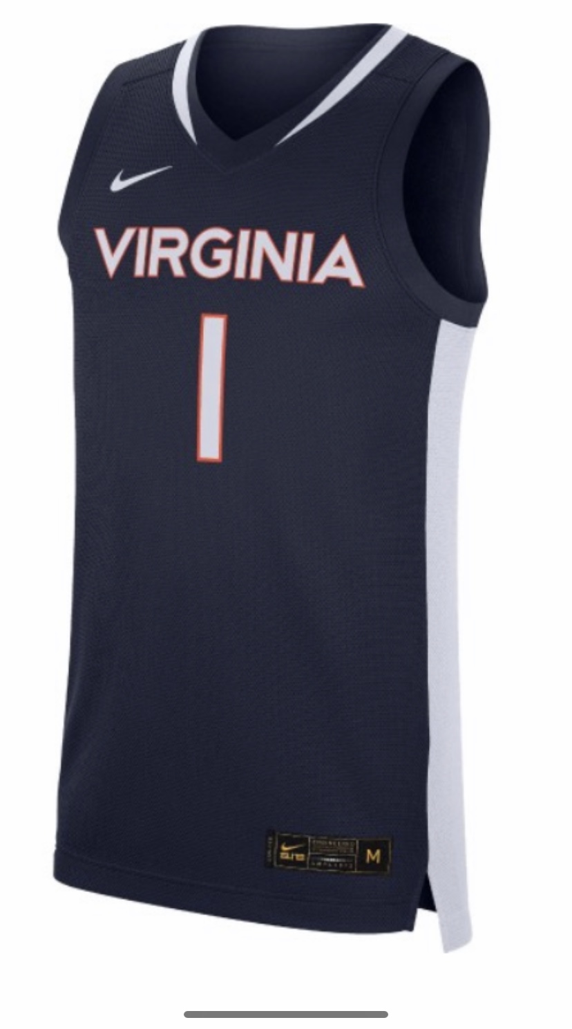
Looks about right. Can’t stand the white collar/numbering personally. The orange looked great.
6 Likes
I’m with you on that. If these are the new jerseys , they look very generic. Not sure why we’d abandon the orange trim, collars and numbering
4 Likes
I’m with you 100%. I try really hard not to be negative about this kind of thing, but I don’t get the white trim at all. Our colors are blue and orange. There is not nearly enough orange on this jersey for my taste.
4 Likes
I’m not real sold on them either. I hope they grow on me.
1 Like
The font looks exactly like Tech’s IMO
Man I really liked the old ones. Woulda preferred just subtle changes to that. But nbd really, sure I’ll learn to love these ones too lol
2 Likes
Remember the shop versions aren’t the exact same as the on court versions. We were due for an upgrade. Our previous jerseys everyone will remember fondly because of the Natty but at least in my circle of friends they weren’t that well received when they were new. The Joe Harris era ones were preferred.
2 Likes
How fortunate/blessed are we to live a life where a jersey change up inconveniences us?
That being said, I am on the team that thinks the actual jersey will be different from the shop one. I like the minimalistic approach, but it’s almost too minimalstic. I am not an old head by any means but the omission of the rotunda on the back would be a glaring fault.
4 Likes
I may be in the minority but I like the sleekness of the design. Shows a bit of edge and modernity. Could nitpick some things but it’s not bad.
Maybe more so relieved that it didn’t incorporate the new chicken cyclops logo.
1 Like
Haven’t heard of anything new on deck for football. My guess is the night game blue blue blue
Wahoops posted an edit of our current jerseys, only with the new font and they looked niiiiice
3 Likes
Yea these are dope
https://www.instagram.com/p/B_X58kggxzv/?utm_source=ig_web_copy_link
2 Likes
Not a fan of the reason behind the change, but yeah, I’d much prefer those
1 Like
I missed that; whats the reason to change?
Eh, if you don’t already know my guess is you wouldn’t believe it or agree anyway.
Is there some hidden reason? Thought it was just the combination of Nike’s new line of jerseys and the rebrand.