3 is definitely the right number of quads
Thus endeth my contribution to the maths thread
3 is definitely the right number of quads
Thus endeth my contribution to the maths thread
I’m pretty exhausted by the transfer rumor hand wringing, and everyone schlobbing Nate Oates and 'Bama’s analytics-first approach piqued my curiosity, particularly with respect to shot selection. I stumbled across the following articles about two Syracuse professors who recently published a paper on the topic. The laymen version and the academic version.
Some quick takeaways if you don’t feel like reading:
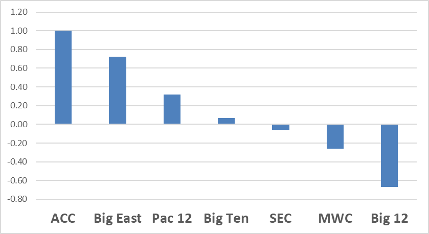
Change in conference strength (per KenPom) as a result of postseason play (positive number indicates a conference improved their strength rating in the postseason):
Those are some big shifts for the ACC, Big East, and Big 12, considering that this is driven by not very many games played (counting the NIT, the ACC played about… 20 games?). A little more OOC scheduling at the end of the regular season would be helpful to refine these models, in other words.
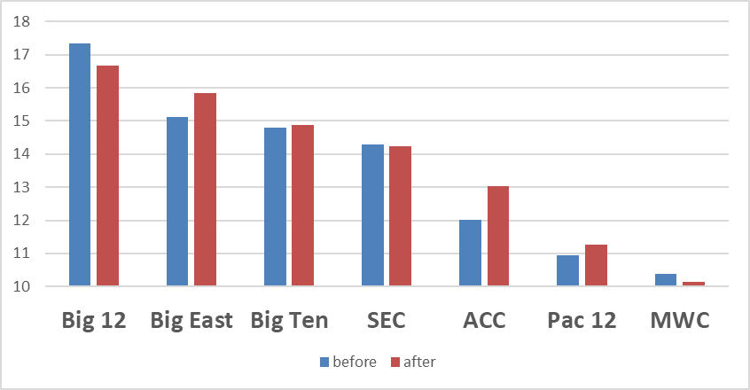
On the other hand, none of this ultimately changed the rank-order at all, it just mildly compressed the differences between the major conferences. This is the absolute before- and after-postseason conference rating:
(Note that I trimmed the y-axis)
The postseason is kind of an interesting experiment for conference ratings in that you’re lopping off the mediocre-to-bad teams in each conference for the last X number of games.
Yeah, it’s weird sample. The models should be able to account for that though, just as they do when top teams from two conferences play each other during the season.
One interesting effect of this: the Big East took a hit after the first weekend, but then as the tourneys went on, UConn and Seton Hall (NIT) just kept on redeeming their conference until the Big East became a big gainer. It was essentially just those two teams responsible for more than all of their net gain. Had the “losers” kept playing maybe they’d have dragged the conference back down again.
I’m having a little fun this morning with the fact that you can download data from Evan Miya’s site; I was curious about the depth of the portal by position, so I took a look at it.
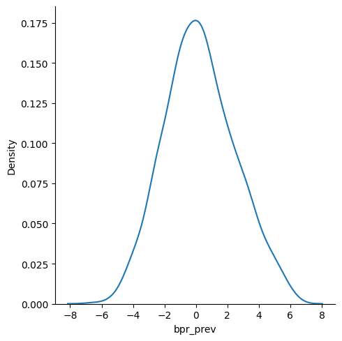
This first chart plots the distribution of players in the portal by their BPR from this season (including those have committed already and filtered for players who had at least 250 possessions from the past season); X-axis is the BPR, Y-axis is the proportion of the distribution at each value:
Unsurprisingly, most of the portal entries cluster somewhere around 0 BPR.
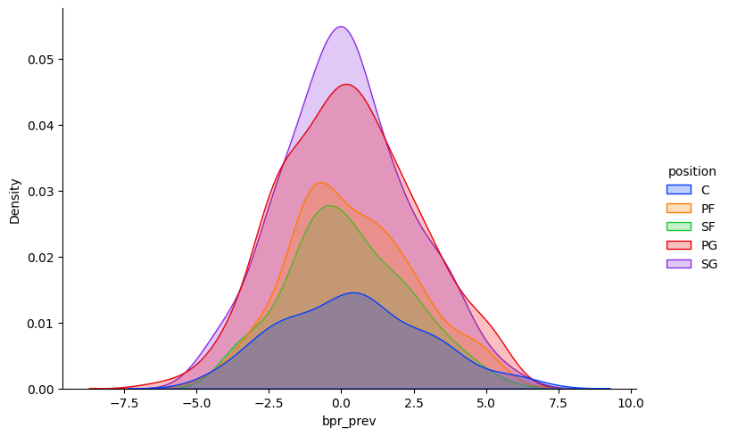
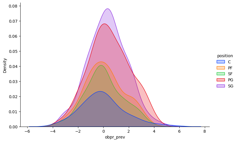
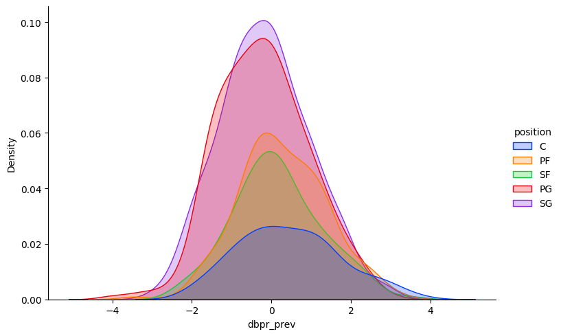
But what is interesting is breaking out the distributions by positions. Here I’ve plotted the distributions for each position separately, again using BPR from the past season, but on the same plot for easy comparison:
A couple things stand out to me:
I think this mostly aligns with folks’ intuitions about what kinds of players are easier or harder to find, but I like having a visualization of how big the differences are.
Bonus charts!
Offensive BPR by position:
Defensive BPR by position:
My takeaways:
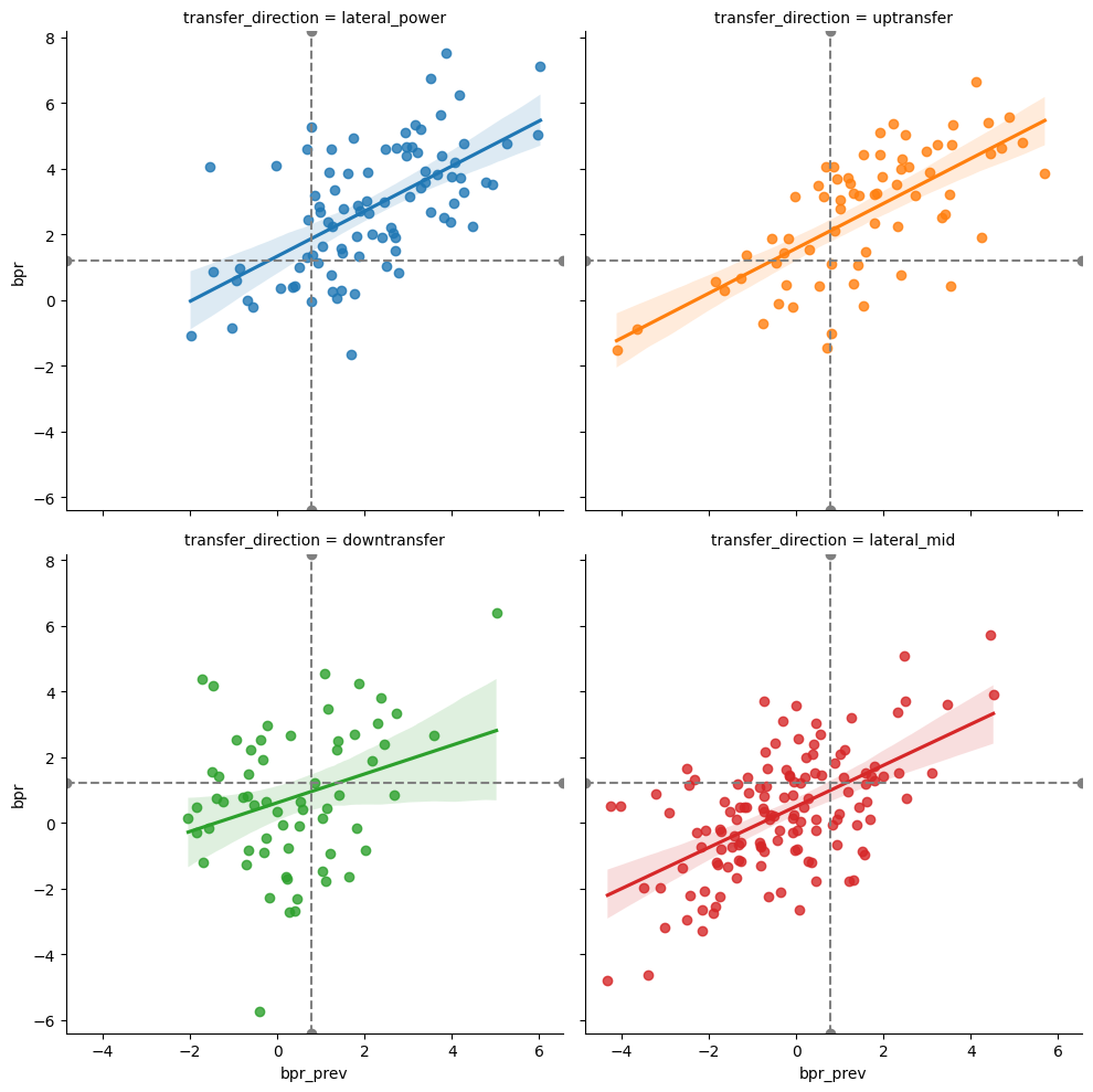
Got some more charts with EvanMiya data. I wanted to look at how transfer direction (up, down, lateral) related to changes in performance, as measured by BPR. For the purposes of these charts, I defined transfer direction as:
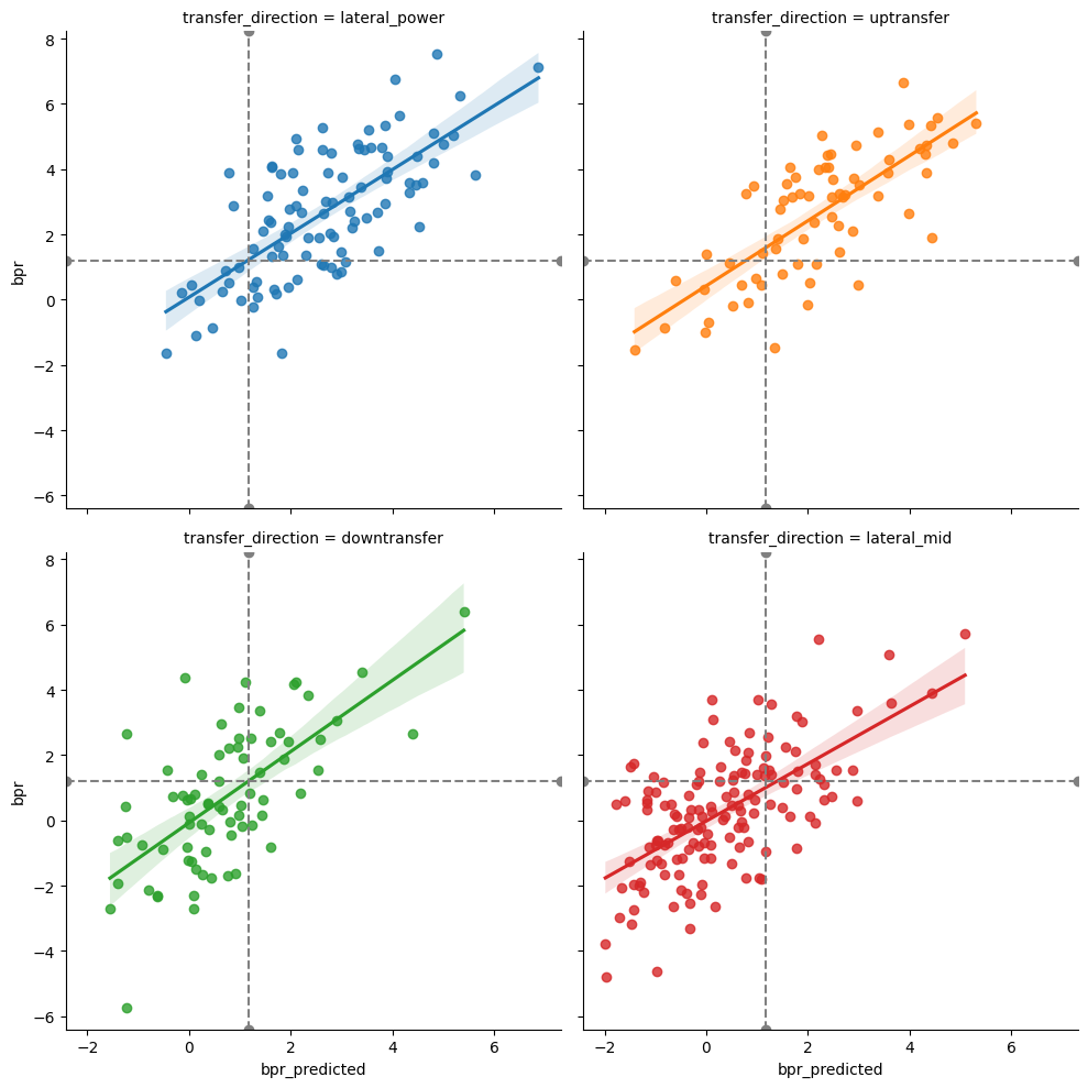
I took a look at how transfers from this past season performed, comparing their 2022-23 BPR to their 2023-24 BPR. I also threw in the predicted BPR from the past offseason’s portal rankings, to see how well that did in predicting actual performance.
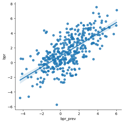
First, I looked at the overall relationship between the 2022-23 BPR (bpr_prev) and 2023-24 BPR (bpr):
A fairly strong relationship between those two, though there are some outliers, like whatever poor soul had close to a 0 BPR in 22-23 and then -6 in 23-24.
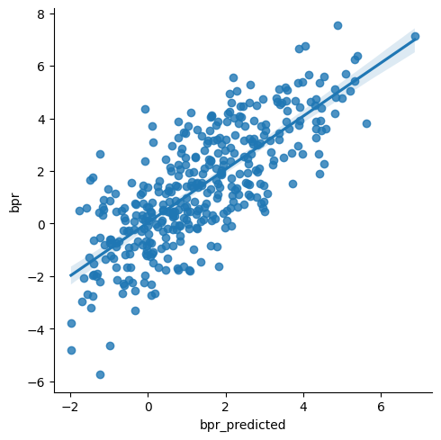
I also looked at how the predicted 23-24 BPR compared to the actual 23-24 BPR:
Not the most exciting plot, but it looks like the predictions hold up pretty well.
But now let’s get to splitting this out by direction of transfer. This will be a busy plot, so I plotted each type of transfer separately. I also added horizontal and vertical lines to represent the median of the variable on each axis.
First, looking at the relationship between actual 2022-23 BPR and actual 2023-24 BPR:
A couple of interesting things going on here:
We can do the same set of plots comparing predicted 2023-24 BPR and actual 2023-24 BPR:
Largely the same stories as with the last set of plots, though the slopes of the lines are all similar in these ones, which maybe suggests that the predicted BPR is better accounting for team-level effects.
Overall, we see that up-transfers can largely hang at the power-conference level, perhaps because only the ones who are likely to be able to make it there, but also because just judging off their BPR at their previous (worse) school might underrate them some.
Question for the crowd: it’s felt like the last few seasons have been up and down through the course of the season.
We start off strong, then have tended to hit a slump in the new year, then done a halfway rebound, but really not enough. Sometimes that cycle repeats more than once over shorter intervals.
If I wanted to test that theory, 1) how would you go about looking at data, and 2) what data would you look at?
I think the timeframes for the ups and downs are all slightly different, so month to month efficiency wouldn’t capture it.
Any ideas of easy to source visuals that show efficiency over time? Especially with some comparisons for median teams. That’s the most obvious place to look.
Great question(s)
I think Torvik’s team page is good place to start (Verifying Browser...).
It shows game over game performance and you can select between different metrics. You get some moving averages, a regression line, and then the D-1 average as a benchmark. I’m sure KenPom and Miya have things, but I don’t subscribe so couldn’t tell ya.
Looks like announcers can retire the “don’t need to take a 3 here, a quick 2 is fine” line when a team is down 3 with under 40 seconds in the game:
Someone tell Dan Bonner. He’s as reliable as they come when it comes to saying the line.

That reminds me of an article I read earlier this year that came to the conclusion that if a team is trailing by more points than time left (say down 5 with 3 to go) they have less than a 5 percent chance to win.
I read that and thought clearly they did not UVa basketball into this data pool. 2 weeks later the NC State collapse happened and I said I rest my case.
My personal metric is 4 + 2*minutes left = a safe lead. With the minutes rounded up.
So if there’s 90 seconds to play and we’re up 8, then I feel good. It’s not 100%, but in the ballpark.
For Dragon and Fresh…. A Pie Chart we can all appreciate.

Mine is almost identical, just +5 instead of +4. But I still don’t actually “feel safe” if it’s Virginia we’re talking about.
We do a lot of back-of-the-envelope prediction of a player’s future 3pt shooting here, so I thought this approach to adjusting for the inherent variability of 3pt shooting quite interesting:
The TL;DR is that you get your predicted shooting percentage by adjusting a player’s current shooting percentage towards the league average, weighted by how many attempts he has had. If he has few attempts, the prediction will be close to the average, but as he makes more attempts, the prediction will move closer to the sample of the player’s attempts.
I like that this approach is simple to calculate and relatively intuitive. But I’m not sure if the same padding value used in the article (from NBA data) could be used for college data.
Harder when a player is earlier in their development curve, I’d guess
Agreed. 3pt shooting in college is a moving target, unfortunately for prediction, but I suppose fortunately for being able to hope for improvement.